Friday, April 30, 2010

Pufferbelly Depot Adaptive Reuse

FINAL BOARDS


PRELIMINARY PLAN


FINAL MODEL


REFLECTION


I really enjoyed this project. It's interesting to see how different parts of the project evolved starting from one photo inspiration to modules, and patterns and so forth. I am happy with the the final outcome but there is so much that I would want to improve on. Everything was going the way I wanted in the beginning, but near the end of the process I struggled with time management. What I thought would only take me two hours ended up taking the whole night to finish. I think it was the SketchUp model that pushed me behind schedule. I also designed really intricate soffits and lighting plans that I wanted to apply in various rooms of the residential space but I only had time to create the soffit for the gallery.


As for my boards, I don't think I showed enough of the residential space. I wanted to include a perspective of the home office, transitions, and the master bedroom on my final boards but I ran out of time so that was crossed off my list of things to do. Initially I planned to create the boards digitally but because of time, that too was crossed off the list. This project really taught me how to problem solve and prioritize. It also gave me a better idea of how much time I need for certain tasks, and how important it is to stick to a schedule and manage time efficiently.

Friday, February 26, 2010

Textile to Concept Model

From my photo inspiration of the King Street Train Station to my series of modules and patterns, and final textile design, the key concept of linearity, movement, and connections have been incorporated into all processes and executions. These concepts were also applied to develop my concept model.

I used my textile design to create the concept model. The intersecting lines and the weblike patterns it created stood out to me the most. It continuously carries your eyes throughout the whole textile design, much like the movement of trains; constantly moving as a result of industrialism and the need for people to keep moving. These intersecting lines are like the intersecting paths of a train, as well as the networking that it enables; trains bringing people together and connecting like the weblike patterns of the textile.

I selected a section of the textile to focus on and develop into a three-dimensional concept. The first shape and form I envisioned in the textile was a pyramid. Next I noticed the glowing webs, a result of the color selection and technique. I then built a pyramid with a square base to serve as its framework. A pushpin was used to make holes in the framework, and silver wire was sewn into these holes to recreate the linear patterns of the textile design. The framework symbolizes the train that enables for to connect, and the sewn silver wire represents the network or people


INSPIRATION
photographed by Edward Bello


TEXTILE


CONCEPT STUDY MODEL


CONCEPT MODEL

Pattern to Textile

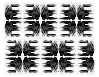
To develop this textile I first abstracted my photo inspiration, the King Street Train Station, and sketched a series of modules. From those modules I picked out two that really expressed my concept of connections, interactions and movement, and then created a series of patterns. By mirroring and rotating the modules, the negative space and the lines and shapes of the module produce a web like design that guides the eyes throughout the whole textile design.

The colors are inspired by a piece of the client’s art, Inversion Without End #7. The piece has an analogous color scheme of greens, blues, and yellows. The surrounding space becomes deeper and darker in color. Tints of blue-green and yellow were applied to the textile design. The adjustments and the coloring of the parti avoid straight lines and solid colors to create a more organic textile pattern. Like the glowing center of the painting, the lines in the textile seem to glow.


INSPIRATION
photographed by Edward Bello


MODULE


COLOR INSPIRATION
Inversion Without End #7
Joe Shlichta
2004
oil on panel
36" x 48"


MODULES


PATTERN


TEXTILE


Wednesday, February 24, 2010

Modules to Patterns

PATTERN I

The module I chose to explore first is my favorite. It has a very interesting composition and a strong contrast between light and dark. To create patterns in InDesign, I first tiled the module, then tried rotating, and then rotating and mirroring. I created six patterns total. It was really interesting seeing the pattern evolve to the last pattern, the pattern that I decided to use.


GRAYSCALE


MONOCHROMATIC


ANALOGOUS


PATTERN II

With this second module I wanted to capture the vertical and horizontal movement in the photo; the movement of train and the towering skyscrapers. I never thought I would use this module because I thought it was so literal, but since it was really different from my other modules I wanted to see what I could create with it. It turned out pretty good.


GRAYSCALE


ANALOGOUS


COMPLIMENTARY


COLOR INSPIRATION

I applied colors inspired from the work of Joe Slichta.


Traveling from wind to light (2008)

oil on linen, 60" x 90"


Waiting under the stars (2008)

oil on panel, 48" x 24"


Bound in a precarious truce (2006)

oil on panel, 36" x 48"

Abstractions to Modules


INSPIRATION

A few months ago a friend of mine, Edward Bello, showed me a photo he shot of the King Street Train Station in Seattle, WA. I instantly fell in love with the photo. When we were required to pick an inspiration that included trains for our semester project, I thought of this photo.
The contrast between the modern skyscrapers and the historical train station suited and expressed our semester project very well; the adaptive reuse and historical preservation of the Pullman, WA Pufferbelly Depot.


PARTIS

After analyzing the photo as a whole and also focusing on certain aspects of the photo I sketched 50 parti sketches that expressed vertical and horizontal movement, linearity, contrasts between light and dark, connections and interaction, and layering. There are a lot of different elements in the photo I was able to produce a good variety of sketches. I decided to use neutral colors since the photo was taken in black and white.


Monday, February 15, 2010

Studio Design

Visited a local artist who just recently designed and constructed her own studio. Took note of what we needed to consider when designing a space for an artist.

WORK SPACE

Adequate work surface
  • May be working on multiple pieces at one time
Space for special equipment

Drying area

Bin to deposit waste

Easy to clean studio

STORAGE

Supplies
  • Does client want to be able to see all supplies?
  • What kind of storage does the client want and need?
Space for finished pieces

LIGHTING

Big windows for medias that can withstand sunlight

Emphasize paintings on showcase

Adequate lighting to be able to see work

White artificial lighting that will not affect colors on pieces

Museum Design

We visited the Washington State University Art Museum. The curator spoke to us about the pieces and interior design of the museum.

CIRCULATION

Interior designers determine the direction and flow of circulation.
  • This can be accomplished by placing dividers or walls that guide people to go a certain direction. Art pieces could also be used as a focal point that encourages people to walk around the museum.
LIGHTING

Important to emphasize and showcase pieces.

VERSATILITY

Museum should be flexible to accommodate different exhibitions and pieces.

Every exhibition is designed differently.

POSITIONING

Positioning of art pieces important, especially large three-dimensional pieces that can influence circulation.